
November 1 – December 13, 2025
Opening Reception: Saturday, November 1, 6:00 – 8:00 pm
In-person Artist Talk: Friday, November 21, 6:30 PM
Moderated by Kathleen Schroeder
SHIRLEY BERNSTEIN – ARTIST STATEMENT
http://www.shirleybernstein.com
“Look deep into nature, and then you will understand everything better.” – Albert Einstein
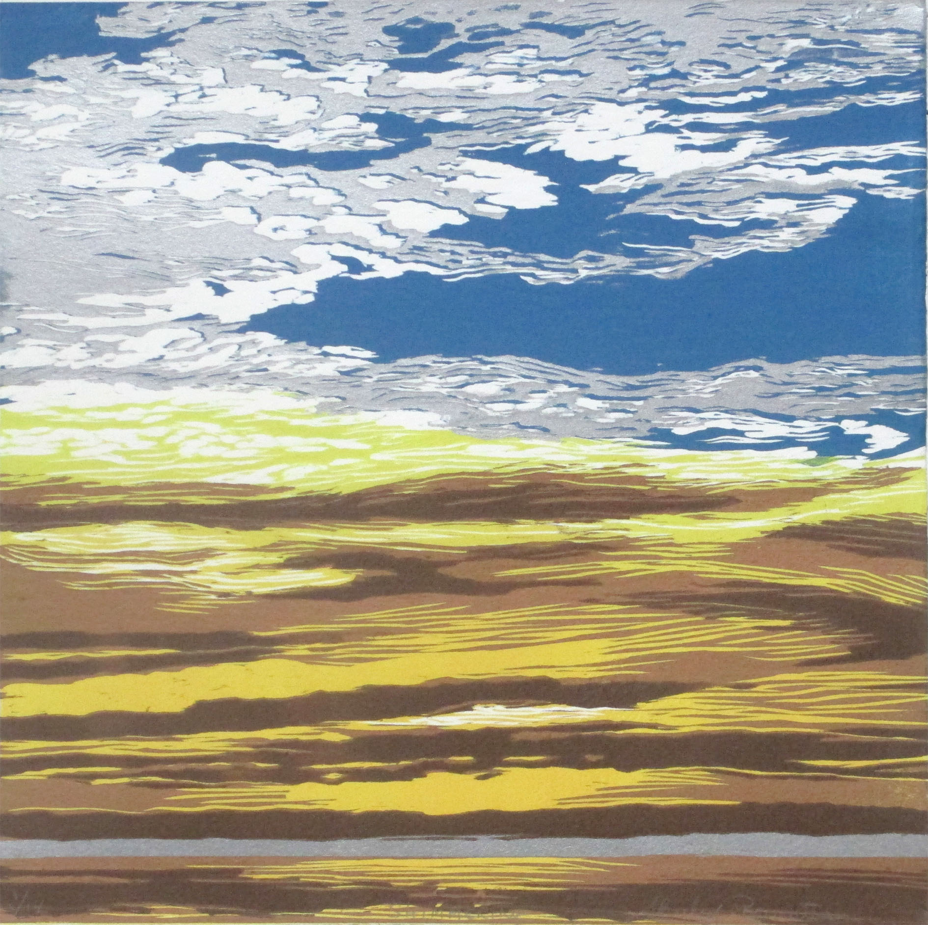
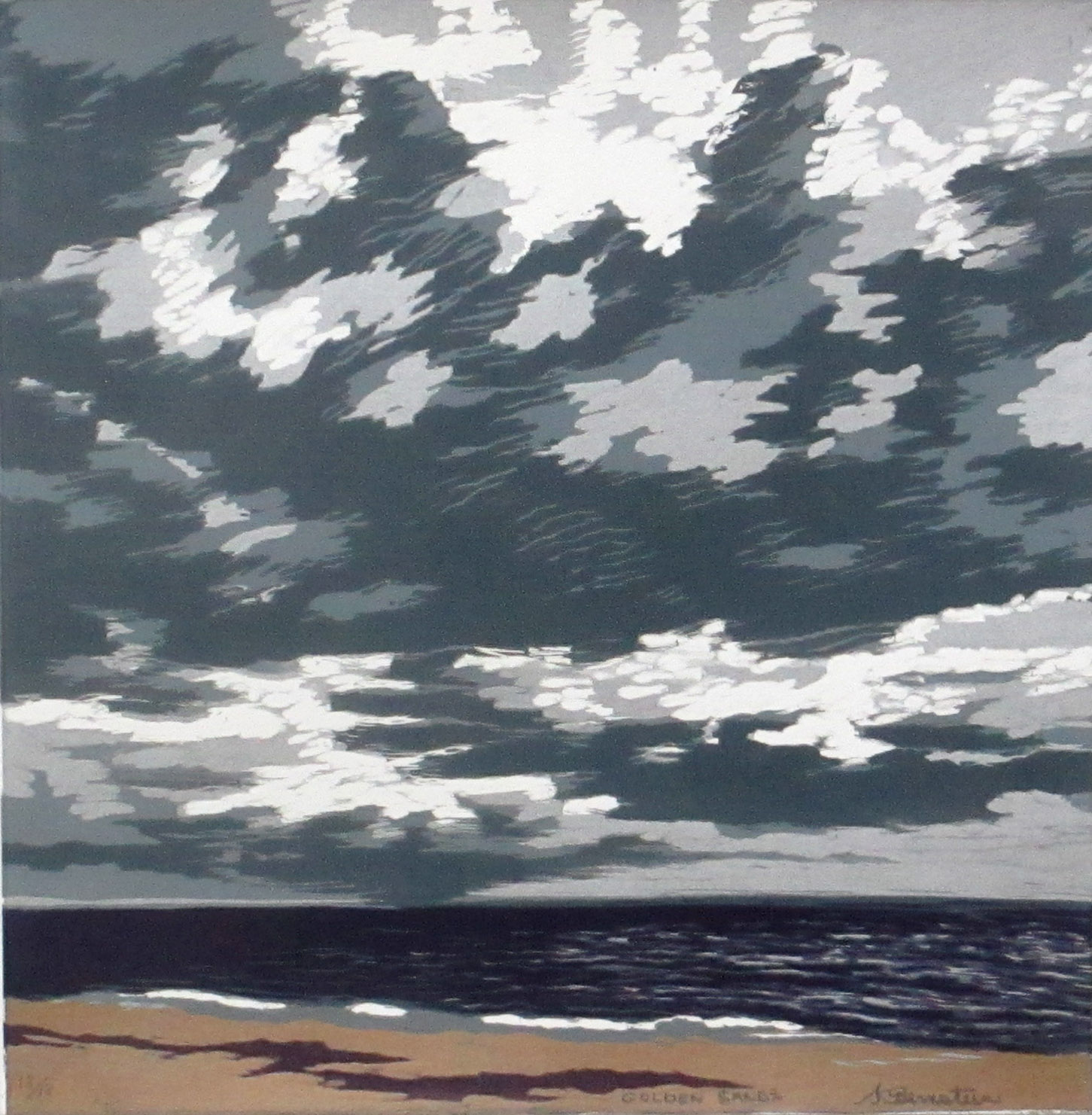
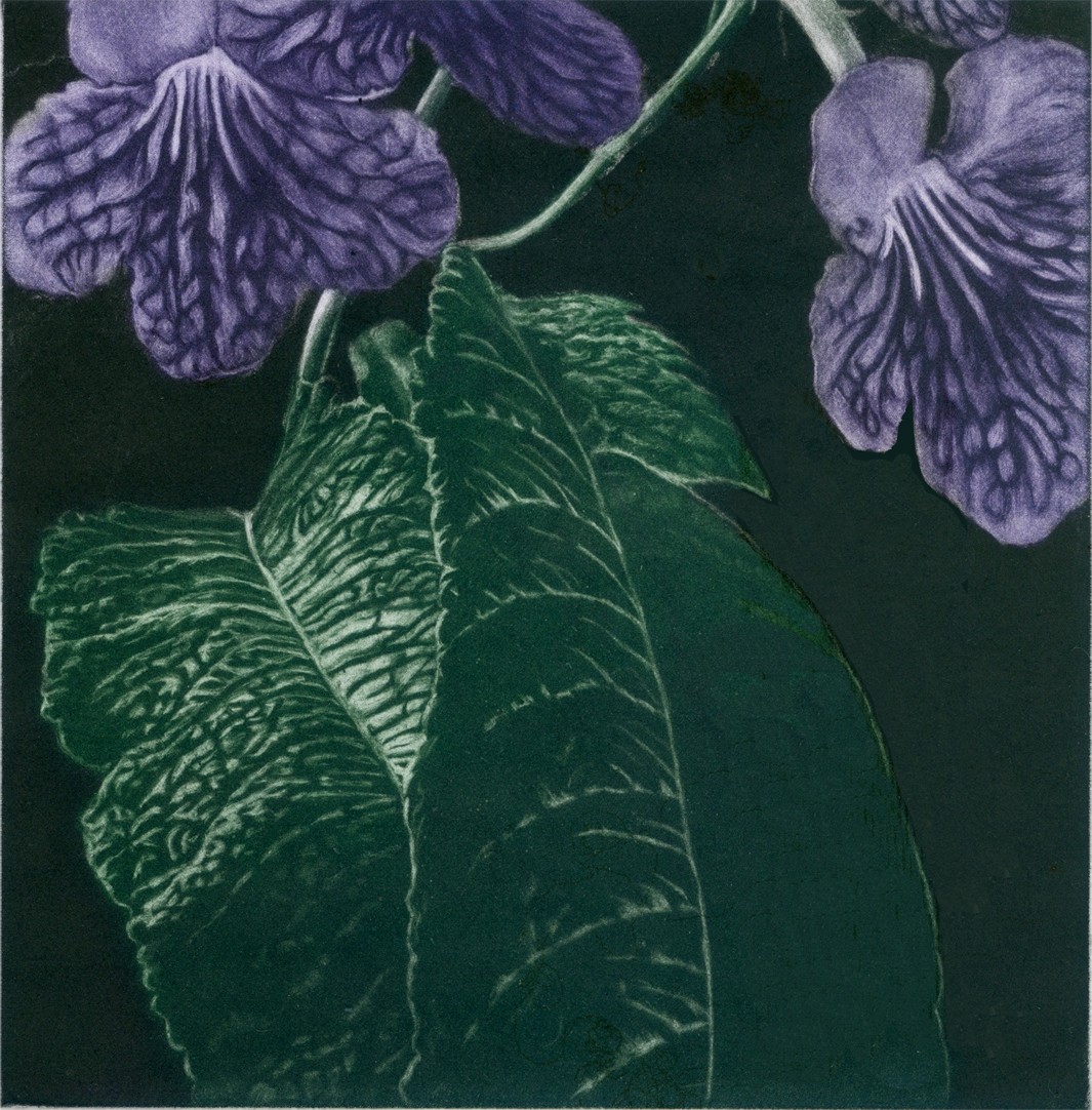
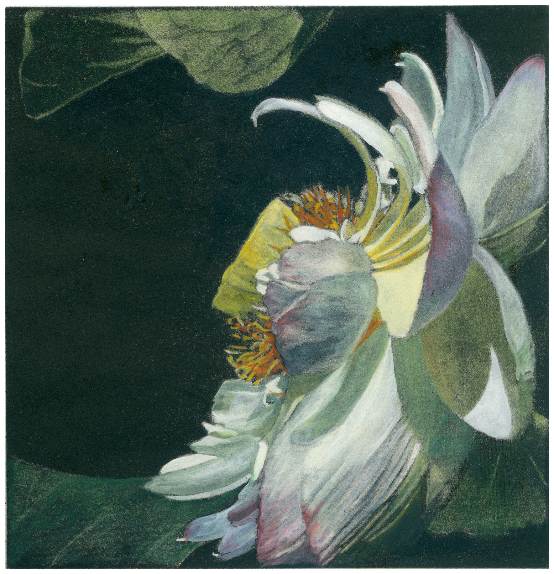
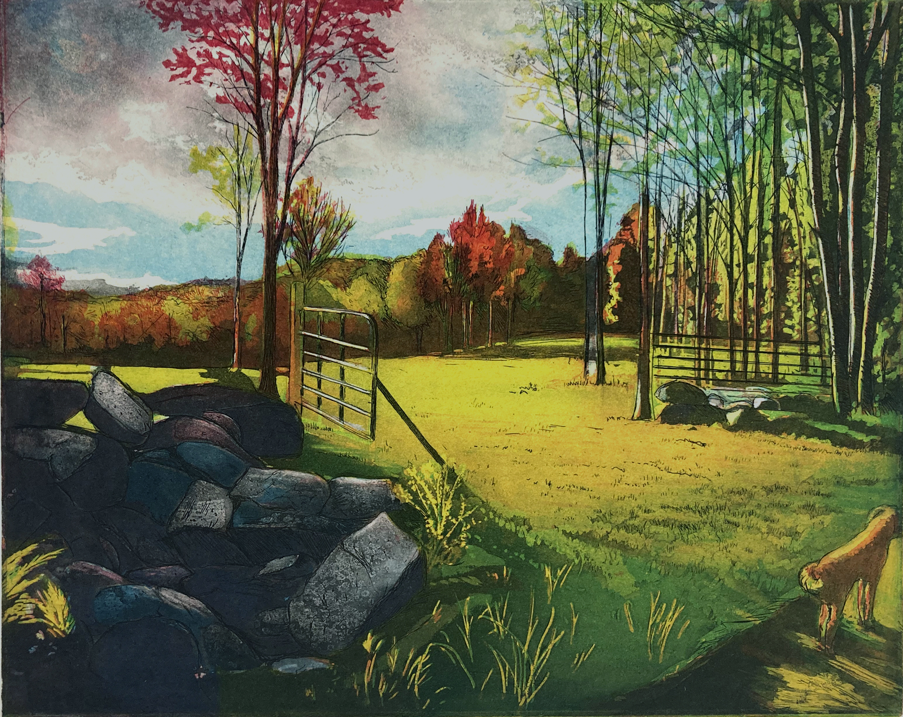
My work has always been involved with a search into nature for the unique forms found there. I would describe my work as organic abstractions in response to forms experienced through observation both visually and emotionally.
When I moved from New York City to the rural northeast corner of Connecticut, the vastness and beauty of the land and sky captivated me. My images began dealing with the moving, majestic, aliveness of the sky and the land. They took on a spiritual quality with a meditative stillness as well as reflecting the force and vigorous action in nature. Luminous energy effects on the clouds and reflections on the landscape are explored through a combination of reflected, direct, filtered and backlighting situations. A beautiful landscape can be a dark one introducing the element of mystery, the notion of magic and the supernatural powers of natural forces.
These series of images explore the boundless space of the sky infused with light disappearing into the unique contours various horizons. The horizon is used to divide the picture plane and suggest an impression of the flora and fauna of that site. The gestural color marks express the forms, movement, light and atmosphere. An environment that is easily accessible for the viewer to enter and perceive is created. It is there that the viewer’s feeling and emotions are encouraged to emerge.
Absorbed in understanding the inherent order in nature, I transform it into my personal view of its logical units. The composing of these images deals with complicated figure-ground relationships where intervals of line, color and value become important factors in penetrating the surface of the picture plane. The marks both symbolic and representational draw the viewer into the essence of the forms transformed to give a sense of something greater and impending. There the viewer is invited in to explore the sensual and provocative forms hidden nature.
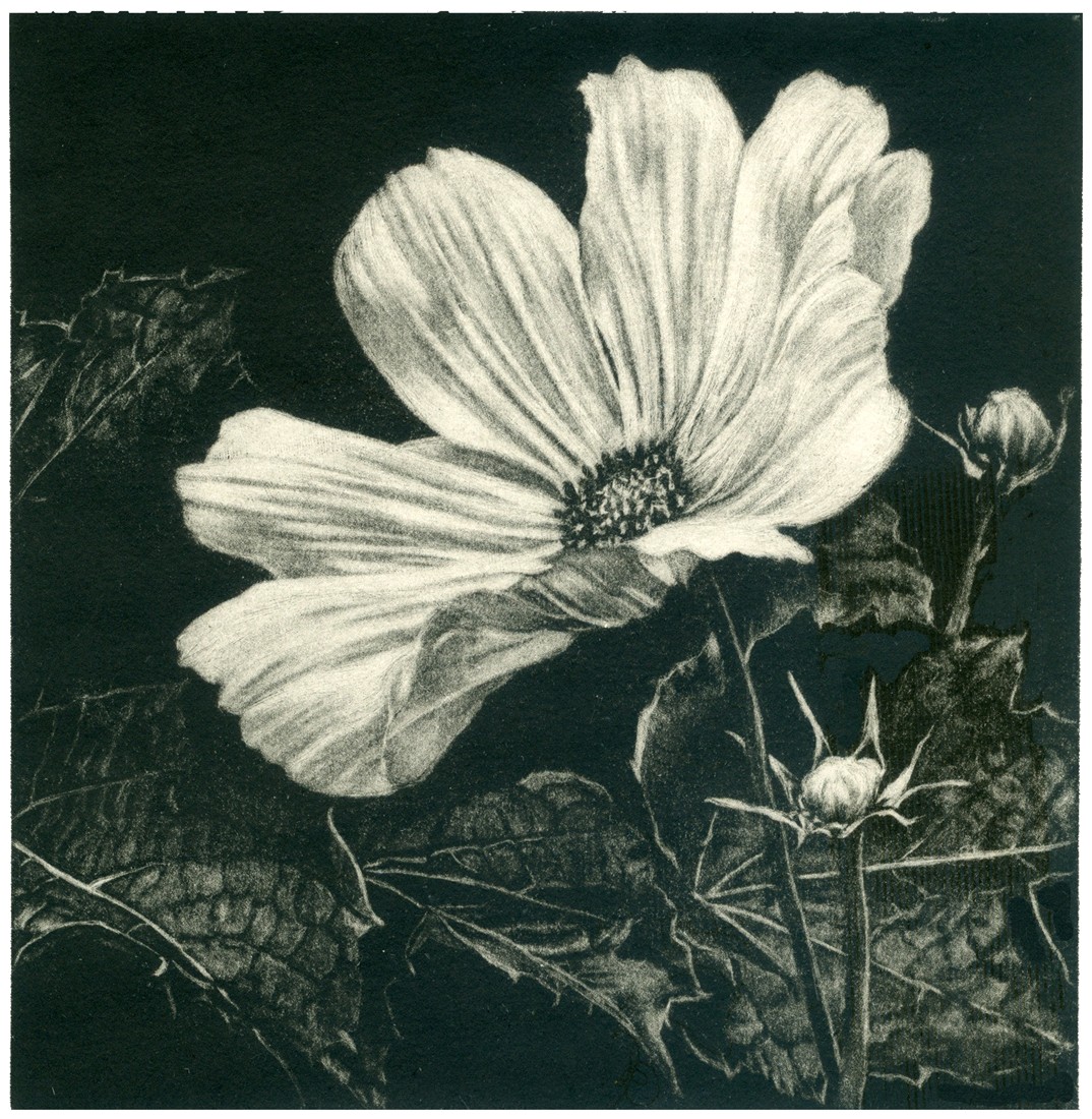
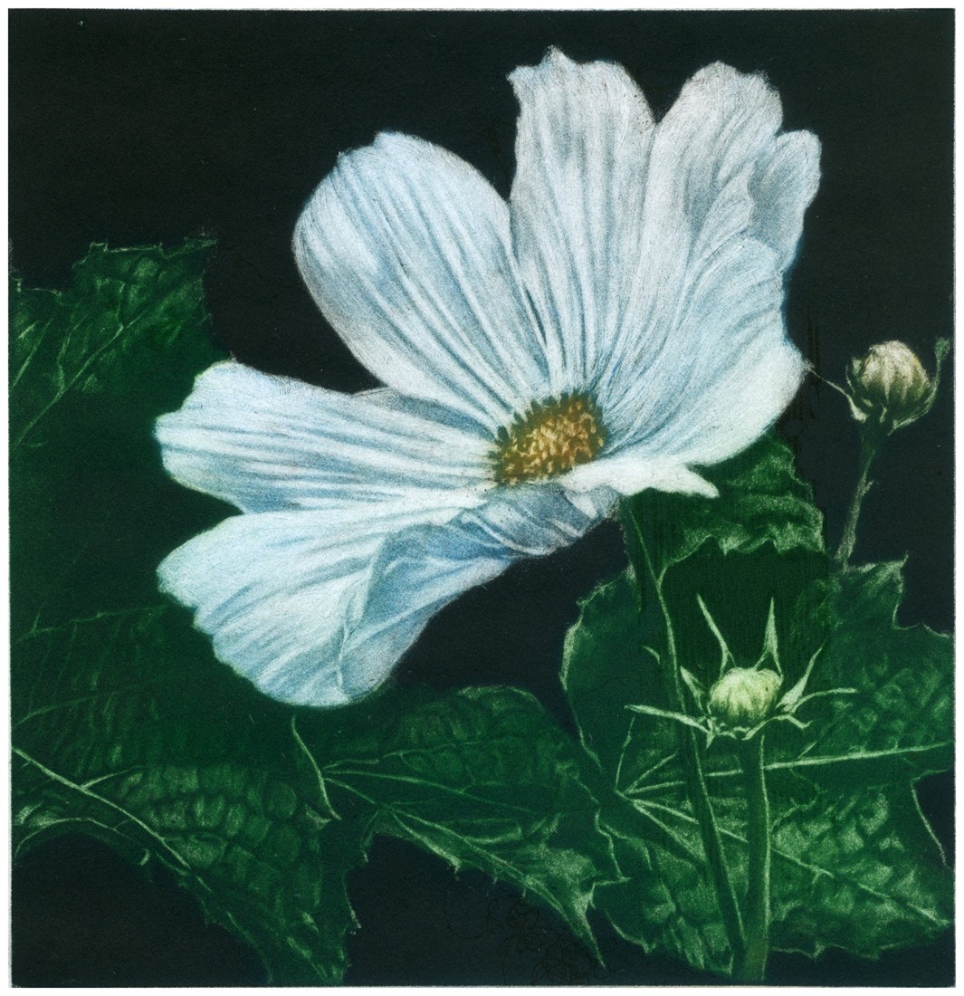
I work in a variety of print media, but I enjoy the physicality of cutting the woodcut to express the energy I experience within the landscape. These woodcut images are color reduction or subtractive woodcuts. Using only one block, the whites are cut out of the block and then the first color is rolled on the surface and printed. The second color is then printed after the areas are cut away from the same block to reveal the first color. This process is repeated with each color until only the last color portion remains on the block. Because you cannot go back and make corrections, some refer to this type of print as a “suicide print”. I also explore these images using oil pastels for a more spontaneous and direct approach.
I work in woodcut, etching, and monoprint, using traditional techniques. For me, printmaking is language, and my graphic vocabulary is abstraction. I am often inspired by nature or literature and then select a medium. I make prints at home, at printmaking shops, in classes, and rarely in a professional studio or during an artist residency..
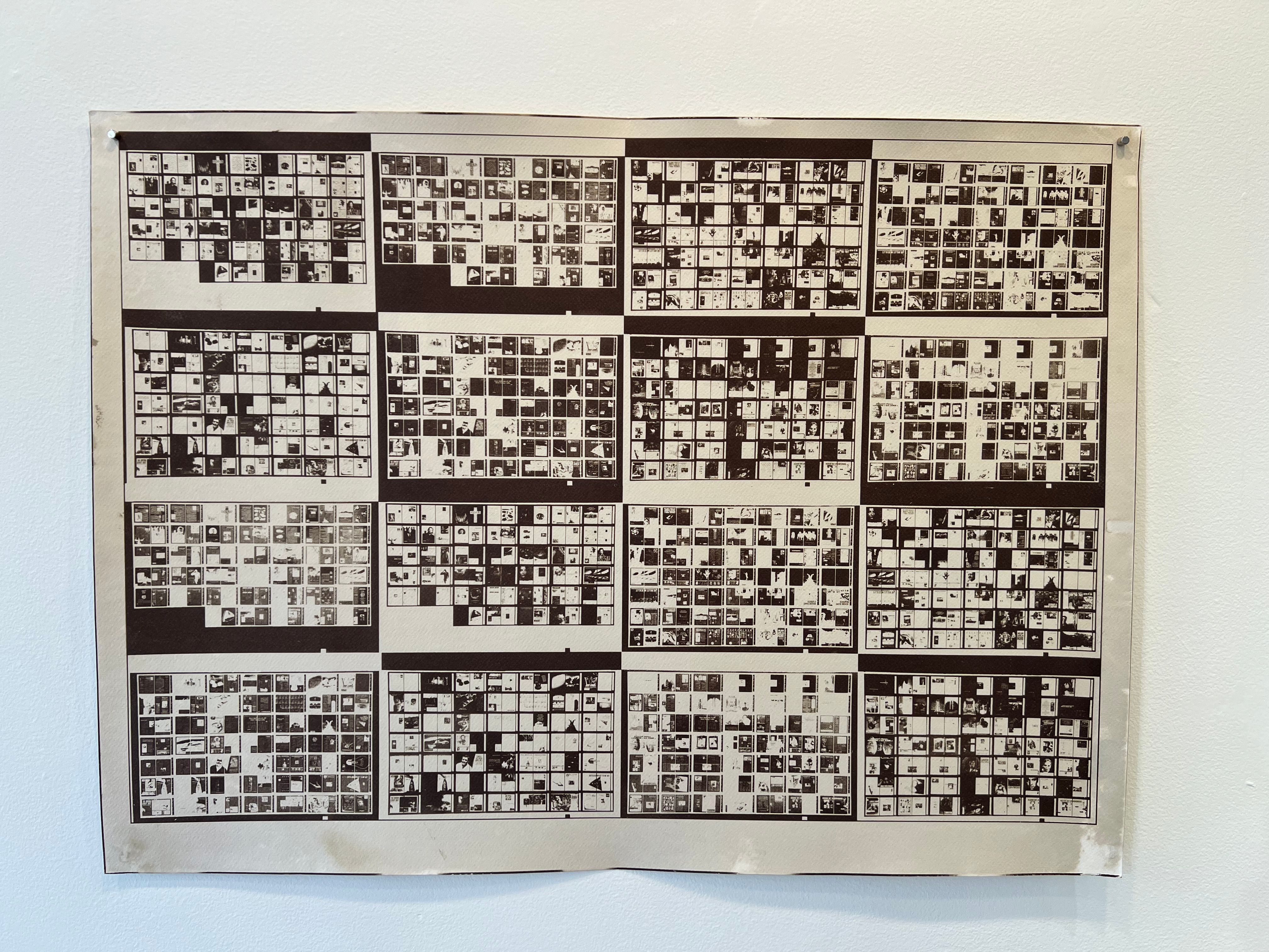
Inspired by Asian printmakers, I have used a scroll format to tell stories. My scroll titled “Penelope’s Girdle” Is a 19-ft long wall-installation of small woodcuts, inspired by Homer’s “Odyssey.” I include two poems by women about Penelope, adding a feminist theme. I hand-printed the small woodblocks washi paper with a baren during an artist residency in Virginia.
Another group of prints is presented in a portfolio box. Again, storytelling. Experts helped me realize what I named the “Quercus” portfolio. Quercus is Latin for Oak. I did botanical research with help Director of Chapin Library Rare Books at Williams College; I printed at the Wingate Studio; and bookbinder Mark Tomlinson made the golden box.
Artist Statement
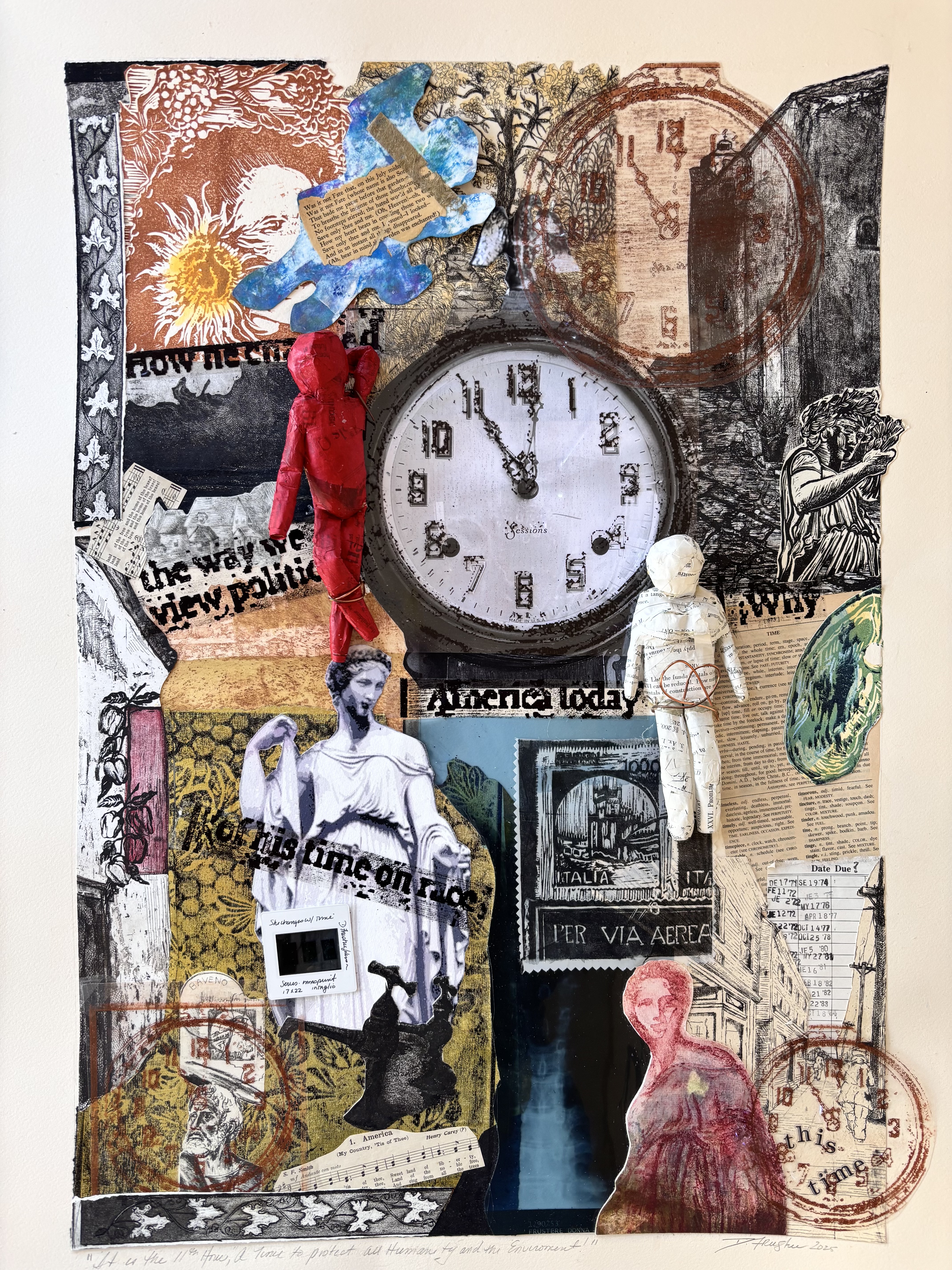
Claudia Fieo’s prints consider the complex tensions between humanity and the natural world. Through her work she seeks to highlight the potential for reconciliation in the face of accelerating environmental and ecological crises. Drawing inspiration from semiotics, poetry, metaphysics, environmental philosophy, and engineering, Claudia employs ancient and contemporary symbols and structures to serve as metaphorical “signifiers”. In a world that feels increasingly more chaotic, the bell, marking a quickening of time, tolls a warning; transmission towers supporting power lines are vital energy corridors, making modern life possible; and the labyrinth, with its purposeful yet serpentine path wending toward center, signifies a quest for equilibrium.
Artist Statement
Claudia Fieo’s prints consider the complex tensions between humanity and the natural world. Through her work she seeks to highlight the potential for reconciliation in the face of accelerating environmental and ecological crises. Drawing inspiration from semiotics, poetry, metaphysics, environmental philosophy, and engineering, Claudia employs ancient and contemporary symbols and structures to serve as metaphorical “signifiers”. In a world that feels increasingly more chaotic, the bell, marking a quickening of time, tolls a warning; transmission towers supporting power lines are vital energy corridors, making modern life possible; and the labyrinth, with its purposeful yet serpentine path wending toward center, signifies a quest for equilibrium.
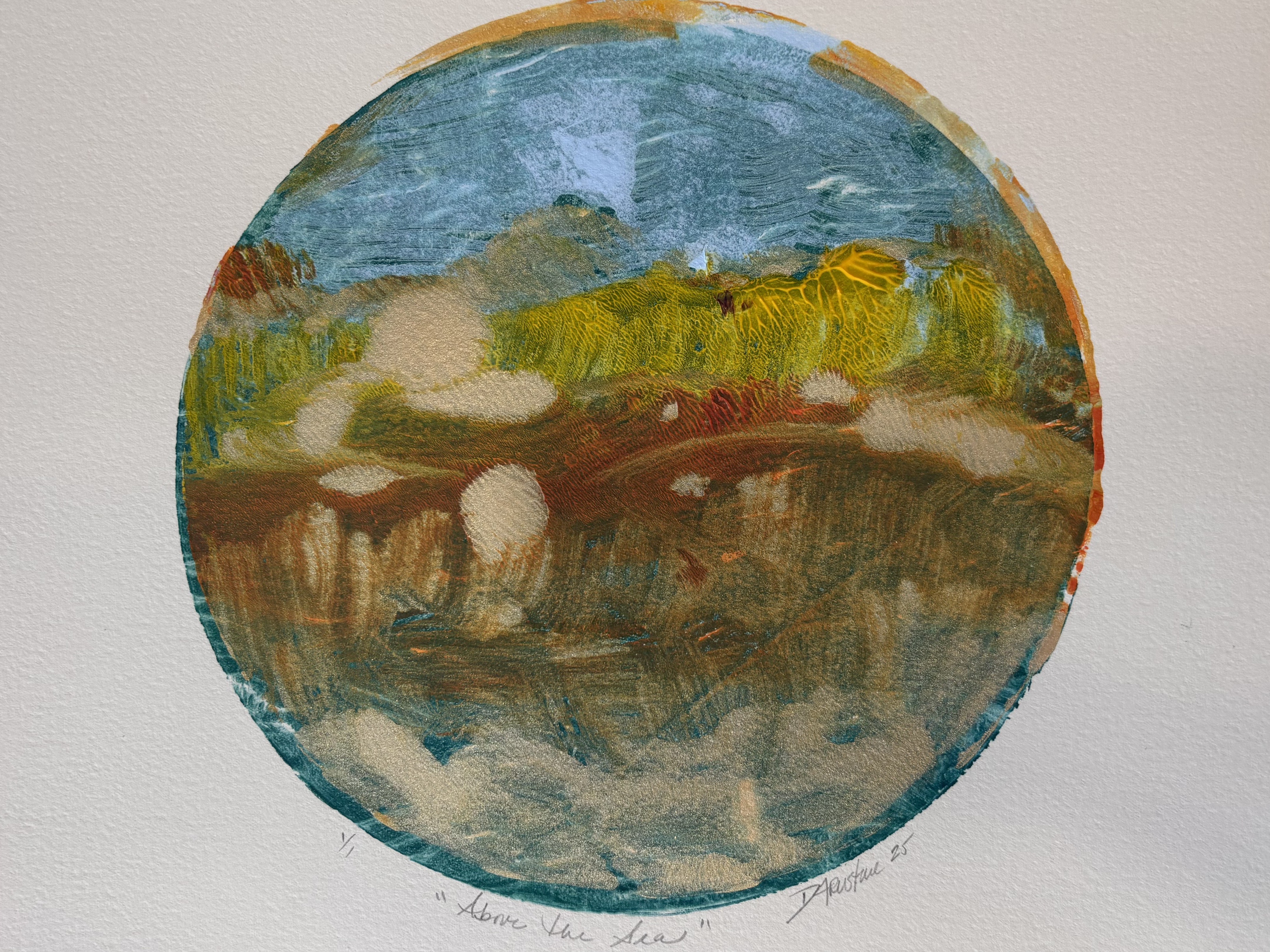
Donna Frustere is a master printmaker and art educator. She has influenced countless students and artists, sharing her expertise and passion for printmaking. Her commitment to teaching and promoting the arts has helped to ensure that printmaking remains a vital and expressive medium.
Specializing in printmaking and serving diverse communities including those with autism. Inspired by family, culture, and tradition, her work incorporates recycling elements and reflects her evolving perspective shaped by personal and environmental influences.
Frustere’s artistic journey is deeply intertwined with her family and surroundings. She often incorporates elements that engage the audience and evoke a sense of reflection on our origins. The printmaking process itself is a metaphor for this journey, with its various stages of layering, proofing, and plate manipulations. Her frequent trips to Italy help her maintain a strong connection with her family, which is a crucial aspect of her work. Her art embodies her family’s visions, ideals, and discoveries.
Her innovative approach to printmaking, which includes exploring fewer toxic techniques has contributed to the evolution of the medium. By demonstrating that printmaking can be both environmentally conscious and artistically expressive, Donna has inspired others to experiment and push the boundaries of their own work.
Frustere believes that we are constantly evolving due to traditional, cultural, and environmental influences, as history tends to repeat itself. She sees herself as a product of her tradition, culture, and environment. Her art reflects her identity, beliefs, and how she processes contemporary issues based on her connections and experiences.
Frustere’s Italian heritage has become increasingly evident in her art, grounding her work and expressing the challenges and triumphs she has experienced over the years. She skillfully combines the tangible with the tactile, exploring a variety of printmaking styles, from monotypes and woodcuts to interpretations of literature an life changes. Frustere’s ability to convey complex themes and emotions through her prints has highlighted the power of art as a means of storytelling and healing.
Donna retired from the classroom in 2018 to focus on presenting workshops, jurying Exhibitions, exhibiting and professional development seminars. Her goal is to emphasize the importance of the arts in providing a voice for everyone. As the founder of the Printmakers Network of Southern New England, Donna exhibits her work both nationally and internationally. She remains actively involved in the arts community through her ongoing contributions to workshops, exhibitions, and professional development.
Artist Statement:
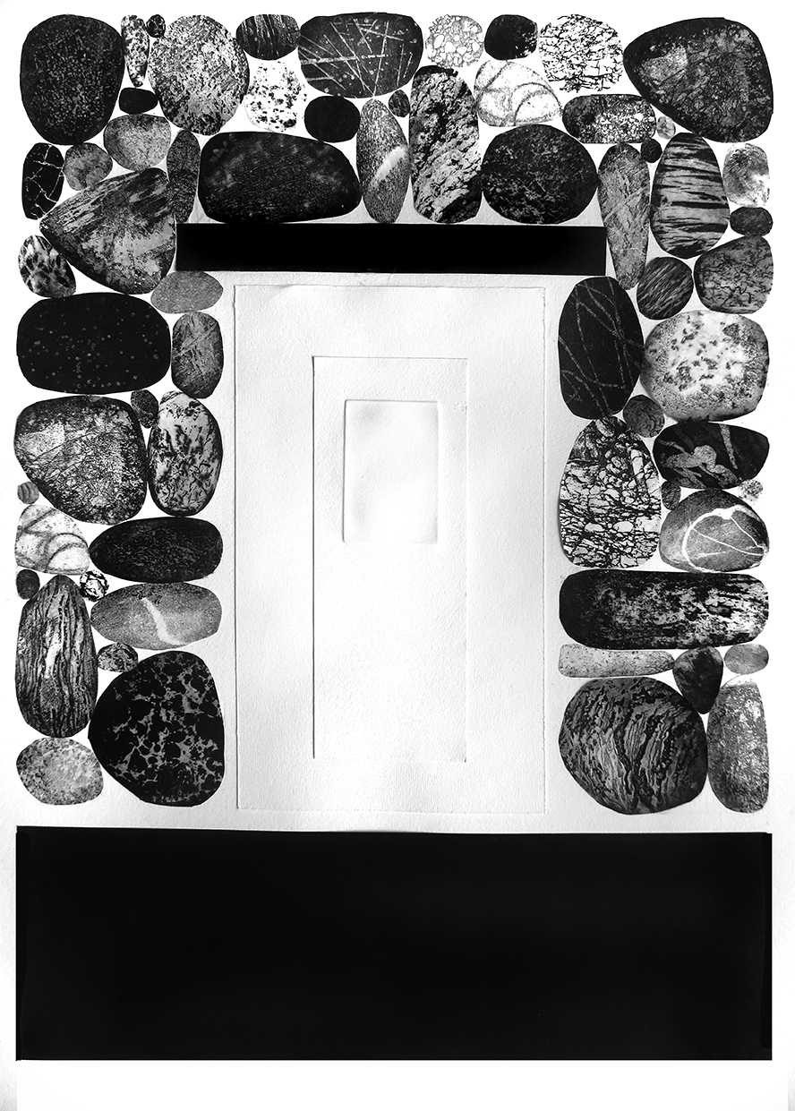
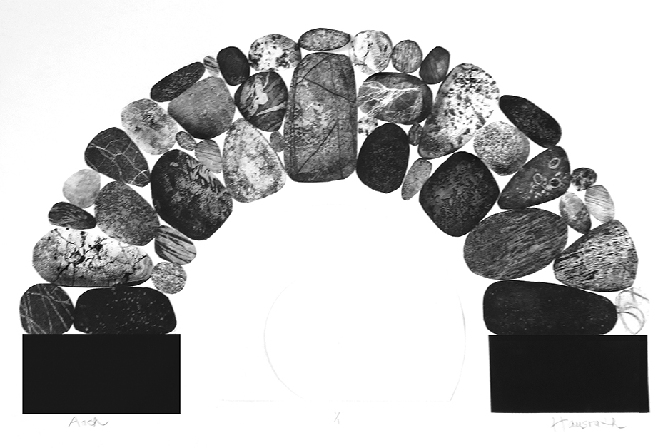
I’m a printmaker because I love the process of transferring ink to paper and solving the technical challenges I encounter along the way. For me, the journey of taking an initial concept and manifesting it into a series of finished prints is very rewarding.
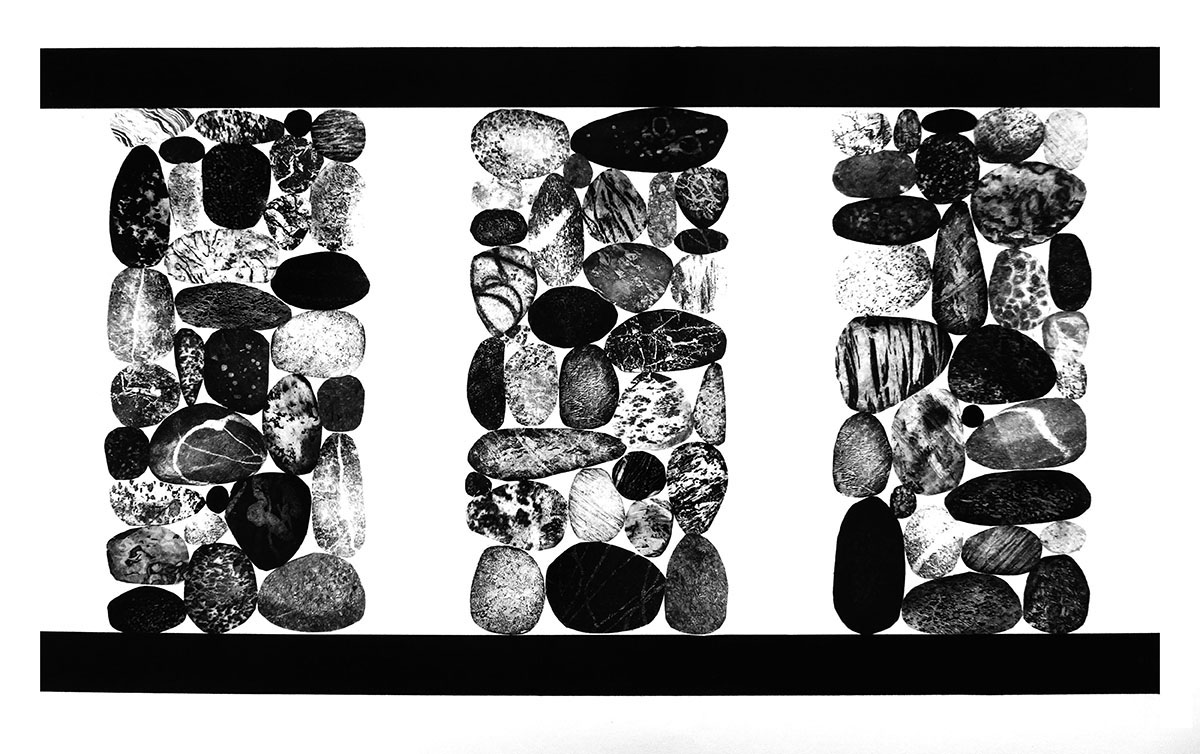
My imagery is often inspired by nature. In my most recent series, the stones reference the essential substance of our earth that has provided human beings, for untold ages, a durable material for tools, shelters, places to worship and burials, the division of spaces and remarkable visual statements. At the same time, stones provide a vast range of aesthetic delights in their unending display of patterns and textures.
Statement: “Oh to be able to travel thru time like a spirit” – Charles Baudelaire, 1821-1867
As an artist, I think of myself as having a painterly spirit. My playful imagination is a key ingredient. Each of my prints or paintings are drawn from a personal visual menagerie where landscapes, portraits or a dreamlike sequence may come to life. All of these make up my kaleidoscope. These images are fleeting and they explore a moment in time which may exist between fantasy and reality. The work is inspired “once I’ve suspended my sense of reality and allowed objects from my menagerie to come to life.” Joan Jacobson Zamore has been doing art all her life but only declared herself an artist after discovering the happy surprise called “the monotype” while auditing a printmaking class at Yale with Richard Claude Ziemann.
I am a printmaker born in Newtown CT, and based in Northampton, MA. Within my work I utilize space, and narrative tools to visually interpret the radical compassion of the human experience, attachment, and grief. I strive to describe the intricate and nuanced relationship between community, trauma, and location. I do this by creating tangible connections through object and image, and emulating the visceral atmosphere of place with layered identity. I do so in the hope of spreading connections and honoring relationships to place.
I often think of myself as a visual storyteller and use my work to explore rather than offer definitive answers. I enjoy complexity, layering, implied meaning and take pleasure in pairing and grouping images to express those feelings, ideas and emotions for which there are never quite the right words. My work acts as a vehicle to voice the expressions of lived experience, my internalized observations of the passing of days, the drama of the unseen and the witness of the objects that surround me. What I seek, through merging the mechanical and the handmade, is an image that might touch people, offer a moment of contemplation, and provide a point for connection to what is in front of them, as well as what is around them.
Artist Statement
The environment has always been a powerful influence on my work. I am drawn to the edges—those overlooked spaces where manicured yards give way to overgrowth, often dominated by invasive species. These plants, though visually captivating in their dense patterns and rapid spread, quietly overtake the land, pushing out vital native flora and reshaping the ecosystem around them.
As I began researching the plants in these liminal spaces, I learned how invasive species alter the balance of nature. They change soil composition, disrupt animal habitats, and reduce biodiversity. This tension between visual beauty and ecological harm sits at the core of my practice.
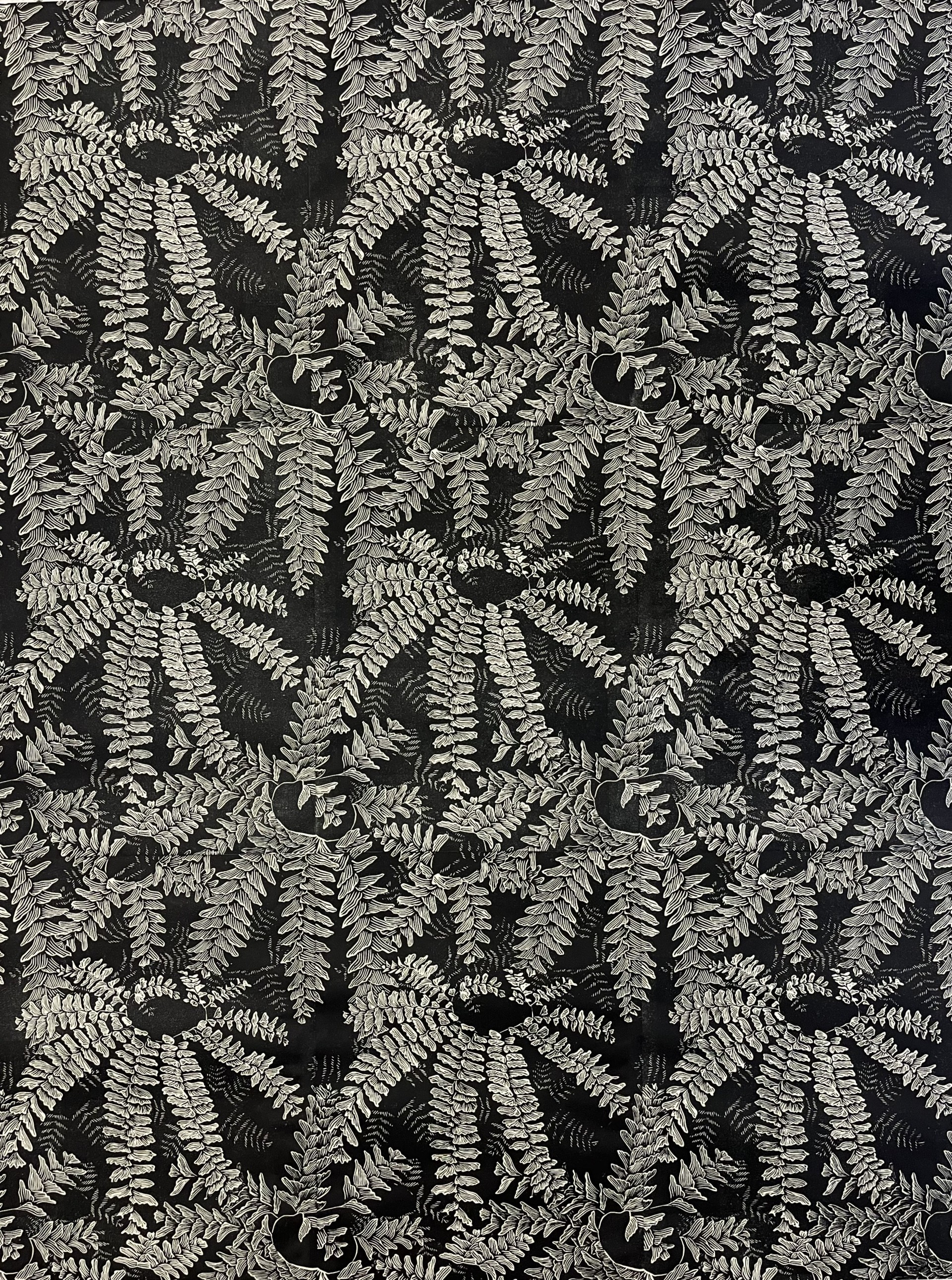
My most recent print explores the idea of reclamation—how native plants can begin to take back space when invasives are removed and dense, intentional plantings are established. The piece, entitled Pteridomania—named after the Victorian-era craze for fern collecting—features a repeating pattern of maidenhair ferns, a native species, rendered in a monochromatic palette.. At first glance, the design appears decorative and rhythmic, drawing from the legacy of the Arts and Crafts Movement. Yet, upon closer inspection, the image becomes more immersive and insistent—the ferns repeat and layer upon one another, creating a sense of quiet encroachment.
Through this piece, I aim to make visible the subtle but significant impact of our surroundings—especially the neglected ones—on our sense of place, ecological awareness, and personal responsibility.
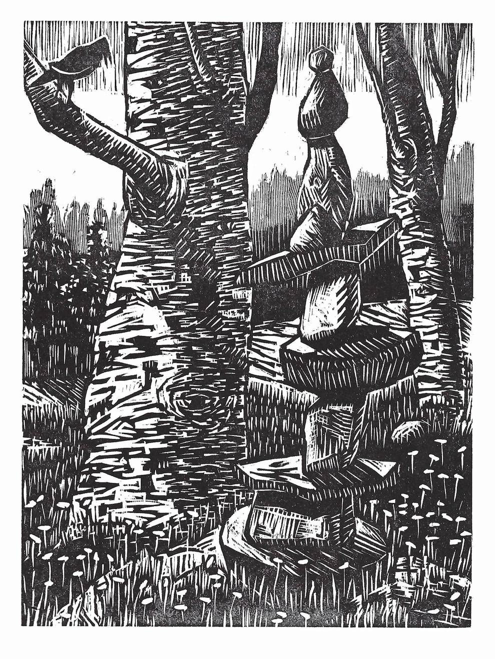
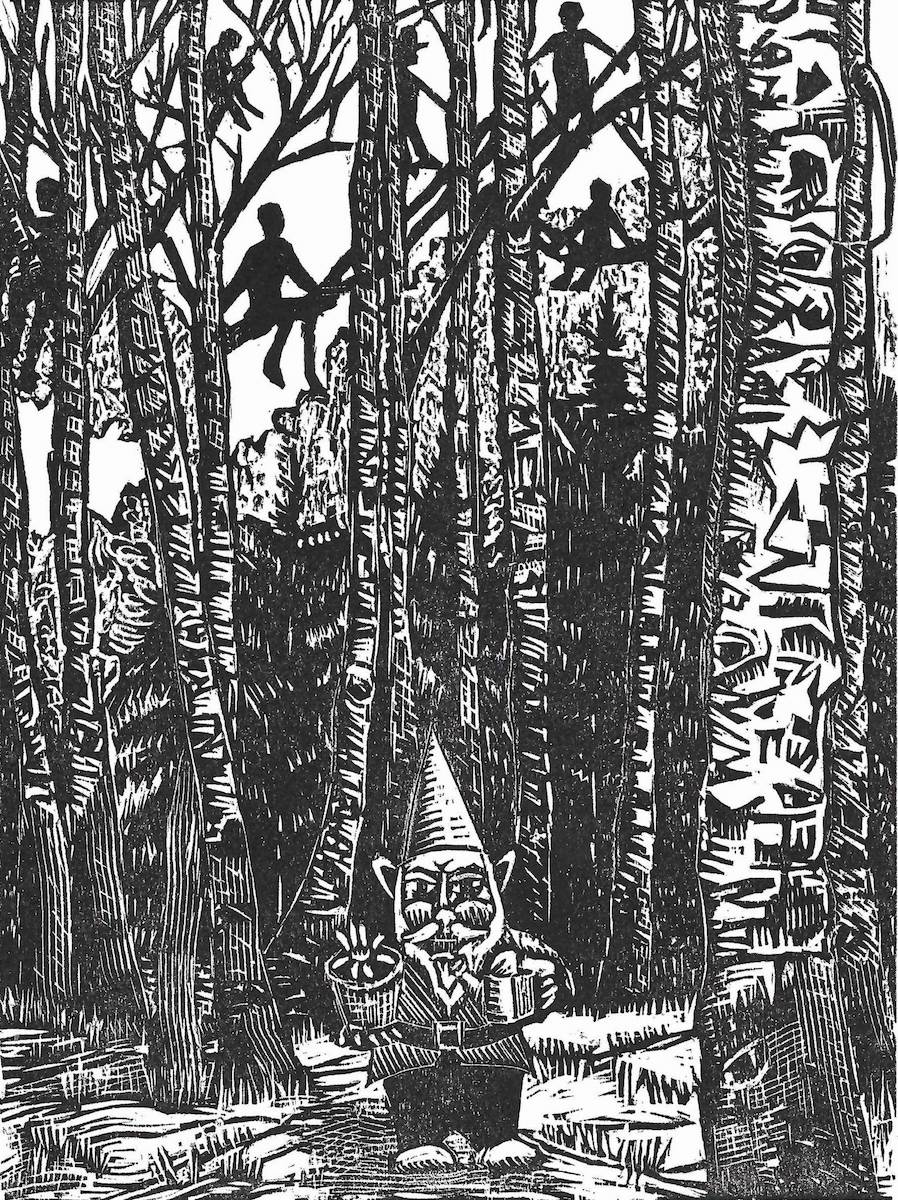
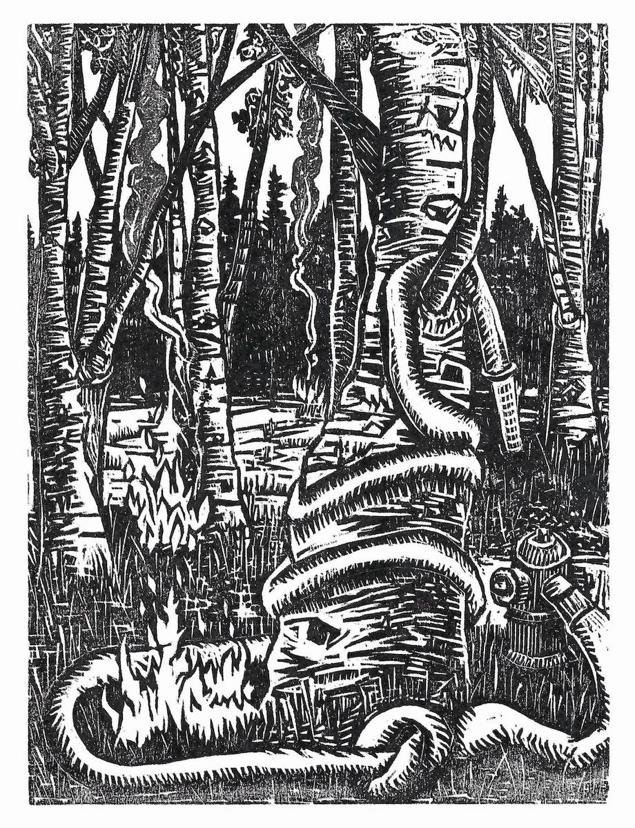
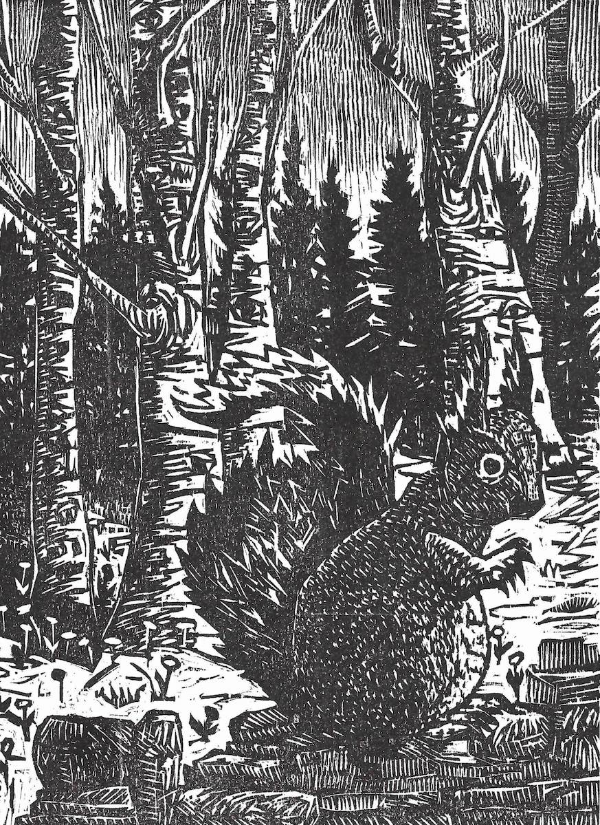
My current series of prints, entitled “In the Birch Grove”, imagines a mythical forest of birch trees, where mysterious and absurd things take place. Though not based on any physical location, the sense of place is important to the meaning of these woodcut prints. Although my prints are often in multi-color, the sombre tonality of b/w is a critical factor in this series of work. Although the ideas and metaphors are personal, they also reflect the current conditions I see today.
My multifaceted practice has grown from my training as a printmaker. I combine multiple techniques creating a visual flow through repetitive mark making, layered color, recognizable symbols/images, and unexpected additions. Working with an ever-expanding lexicon of matrices in printmaking, drawing, and artist’s books, I engage with hand-made paper and textural hand stitching in the spirit of an ongoing conversation. Rhythm and awkwardness, sign and context, space and presence are my close conceptual companions. I am fascinated by our capacity to learn to read abstract marks and how we are changed by the mode of communication used. Folds and elongated formats and patterns emerge as a shift in the flow: what isn’t communicated or may never be known. I work to re-integrate a felt sense of being part of a much larger, and often mysterious, whole. The long narrow formats embody a sense of the passage of time, narrative, or evolution. Collaborations with musicians have affected my work, inspiring and encouraging me to think about sound and notation more expansively. I am constantly seeking connections between artistic mediums and people, working to integrate the vast interconnected realm that we consciously and unconsciously share.
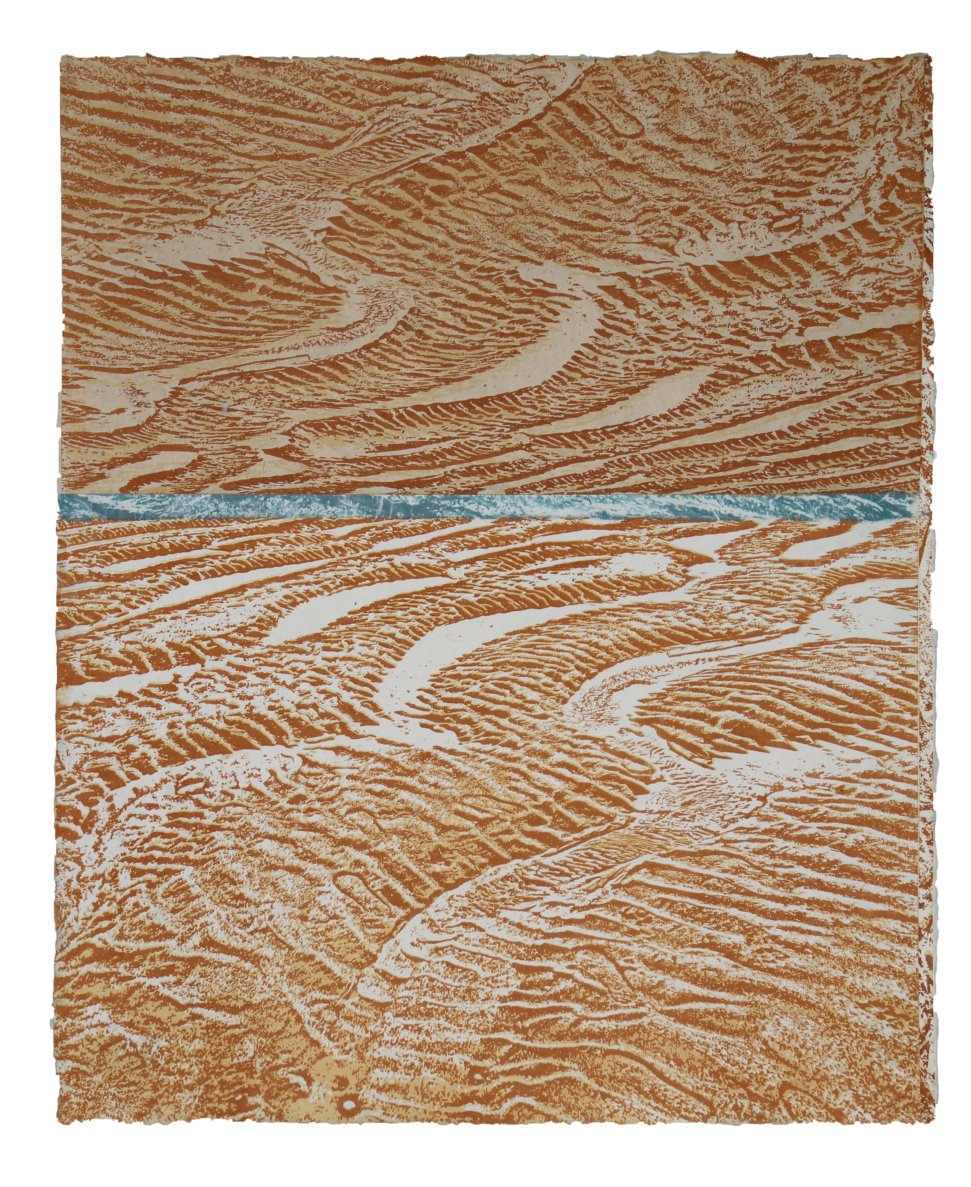
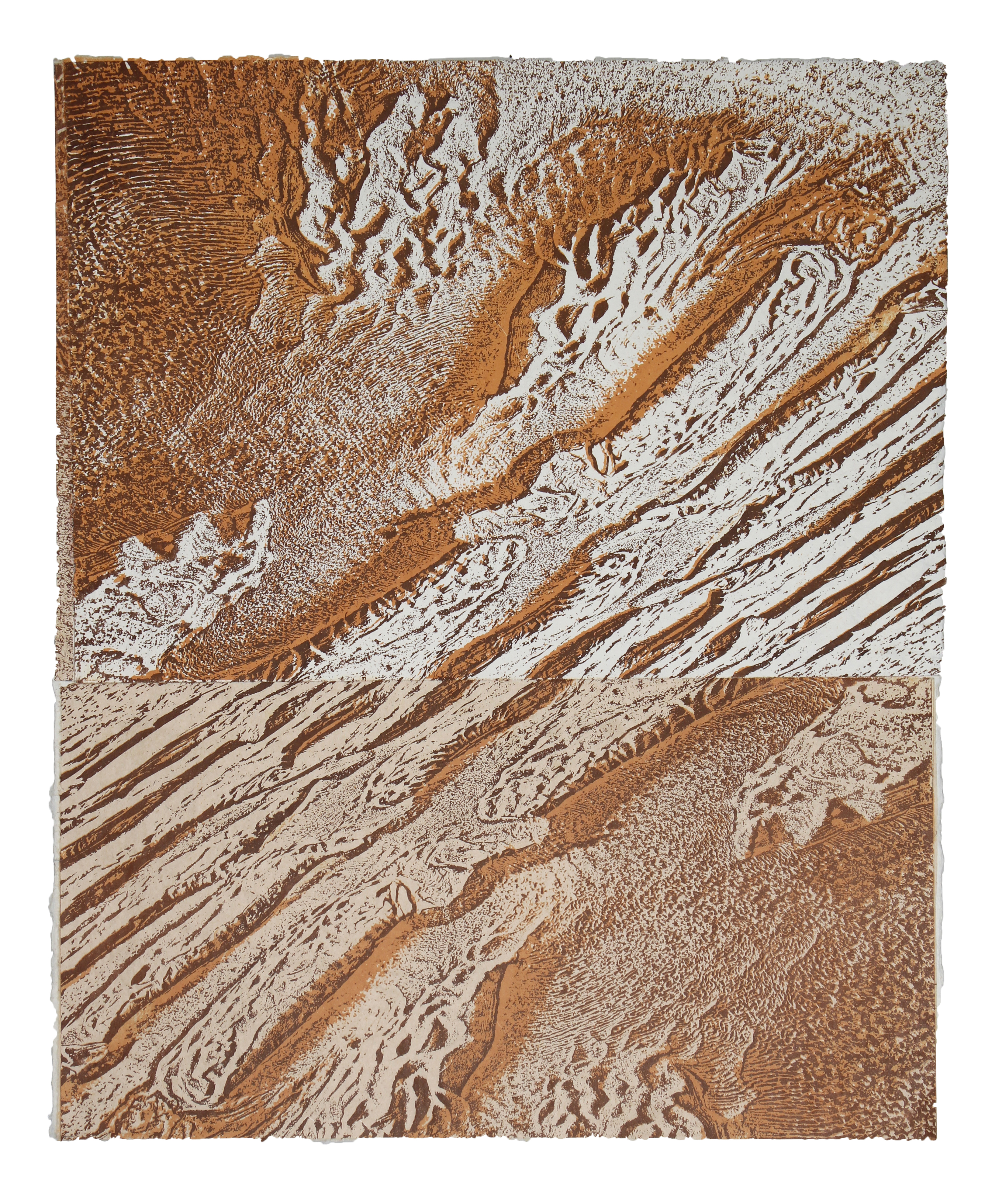
Barbara Pagh
Fluctuations arose out of observing the details of patterns formed in sand over the fall and winter seasons, particularly at Narragansett Beach, in Rhode Island. I walk on several beaches in that area on a regular basis, particularly in the off-season when there are fewer people on the beach. Typically I walk down the beach where the Narrow River converges with the waves of Narragansett Bay, and have noticed how the sand patterns changed radically in the winter of 2024 when two storms demolished a dune landward of the beach and sand filled in a small channel of the river. That area of the beach was always dynamic . These ephemeral patterns change constantly, depending on the wind, and size of the tide and waves.
In these prints I am not attempting to create a realistic representation of place, but rather a subjective impression based on structure and color and the resulting layering of texture and form. The subsequent images require you to look at the landscape in a different way; to look closely and focus on details that might otherwise go unnoticed, which is increasingly important in this time of our evolving landscape, due to climate change.
Process
My original photographs are altered in Photoshop using filters that break down the image into black and white. In my process there is an abstraction that occurs as I break down the image into a graphic form. These images are the printed out onto Pictorico film as a positive. They are then exposed onto a light sensitive positive plate and printed lithographically, using oil-based inks. I make the base paper out of abaca and some of the images are printed directly on that paper. Others are printed on various Korean or Japanese papers. These papers come in different colors and can be collaged onto the abaca after printing. I don’t have a set, finished image in mind when I start. When I begin printing, I look at the original photos for color choices, but as the work progresses, the final print becomes more of an intuitive statement, as I piece together multiple images. Each print is one-of-a-kind.
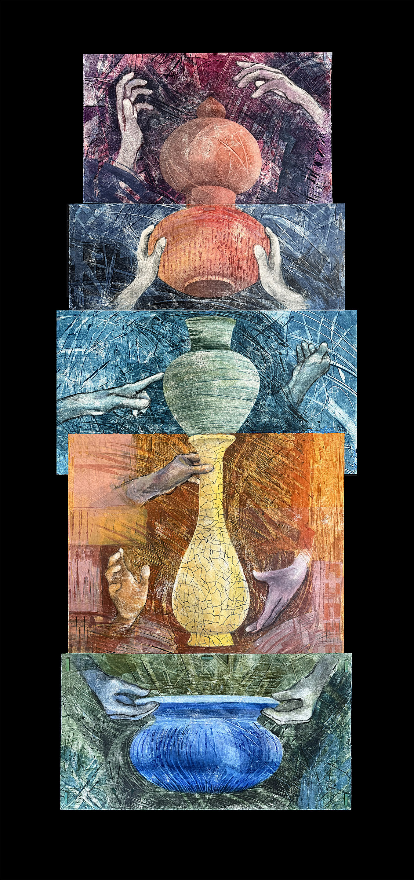
Artist’s Statement
The spontaneous and eclectic character of monotype, and the serial potential of monoprint have influenced the way I work in traditional forms of printmaking. Monotype offers the ability to combine multiple mediums and techniques in a print. This can be accomplished all in one layer or impression, or by superimposing images in several impressions, thus providing a facile means of overlapping colors, patterns and design elements of varying opacities. Some of my projects feature transformational concepts that benefit from this layering of content and pattern and the subtle or subliminal information it provides. Unique to monotype, the artist’s decision-making process is often recorded and visible in the print, especially in a series of monoprints where one print may contain vestiges of a previous impression. With each impression the artist can capture or delete the irregularities (planned or unexpected) that might occur on the printing plate, while developing the image or transferring it from plate to paper.
My monotype process combines hand pressure and the use of a mechanical press to print the image. Both methods produce fine detail, however I find applying just the right amount of hand pressure on the back of the printing paper to achieve subtle tonal variations or crisp edges is both challenging and satisfying. That may be the reason I am also drawn to the historical form of printmaking, Japanese woodblock (mokuhanga). Aside from the appeal of working with a natural material and simple tools, mokuhanga requires the melding of one’s tactile and visual senses with every step: carving the block, achieving the proper feel and consistency of ink and binder on the block, and just the right pressure on the brush and on the back of the paper to pull a successful print. The process is focused and labor intensive. I have combined wood blocks with monotype techniques, but I am more inclined to achieve that spontaneous monotype quality I like so much in carving and printing the blocks rather than combining the two printmaking processes.
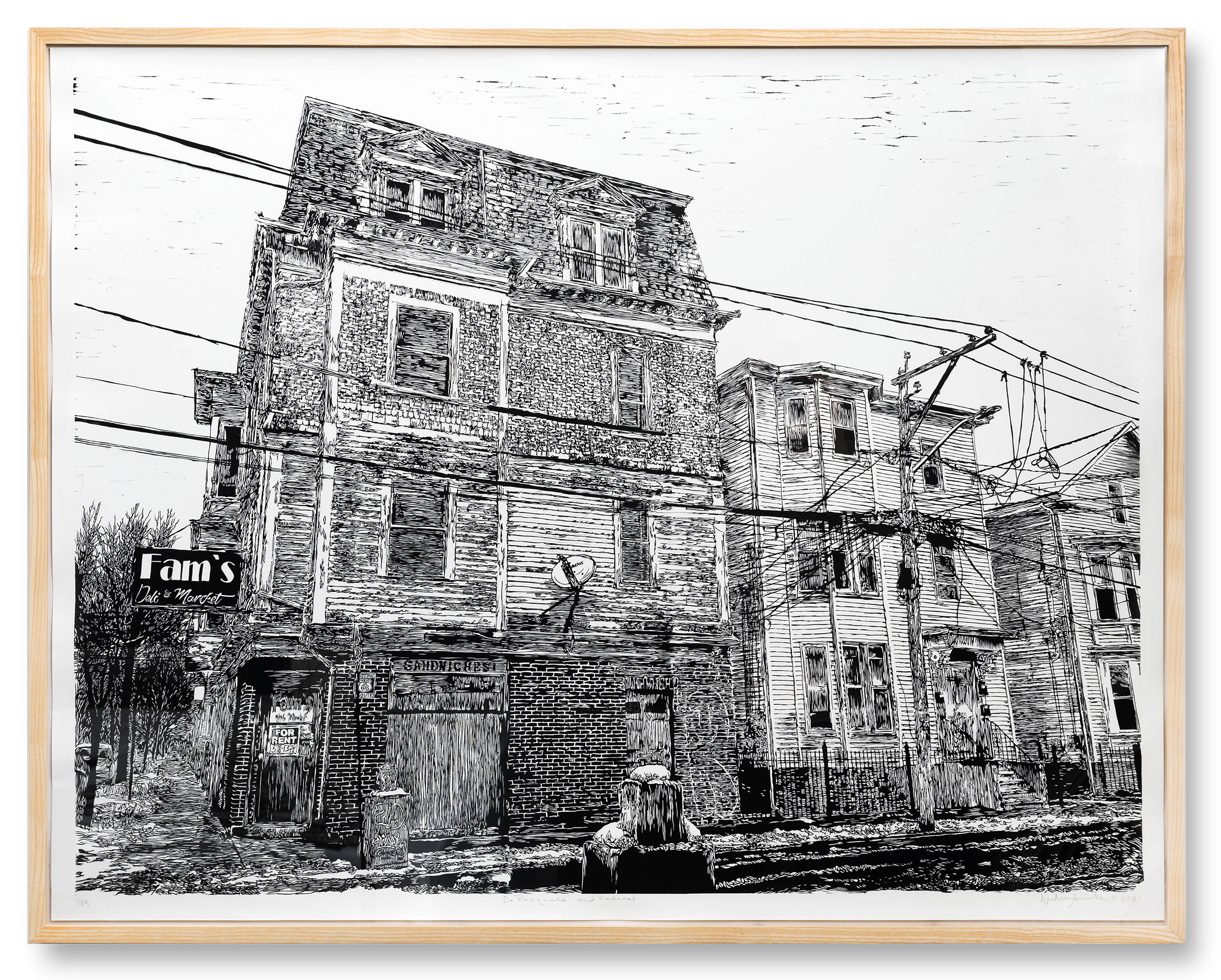
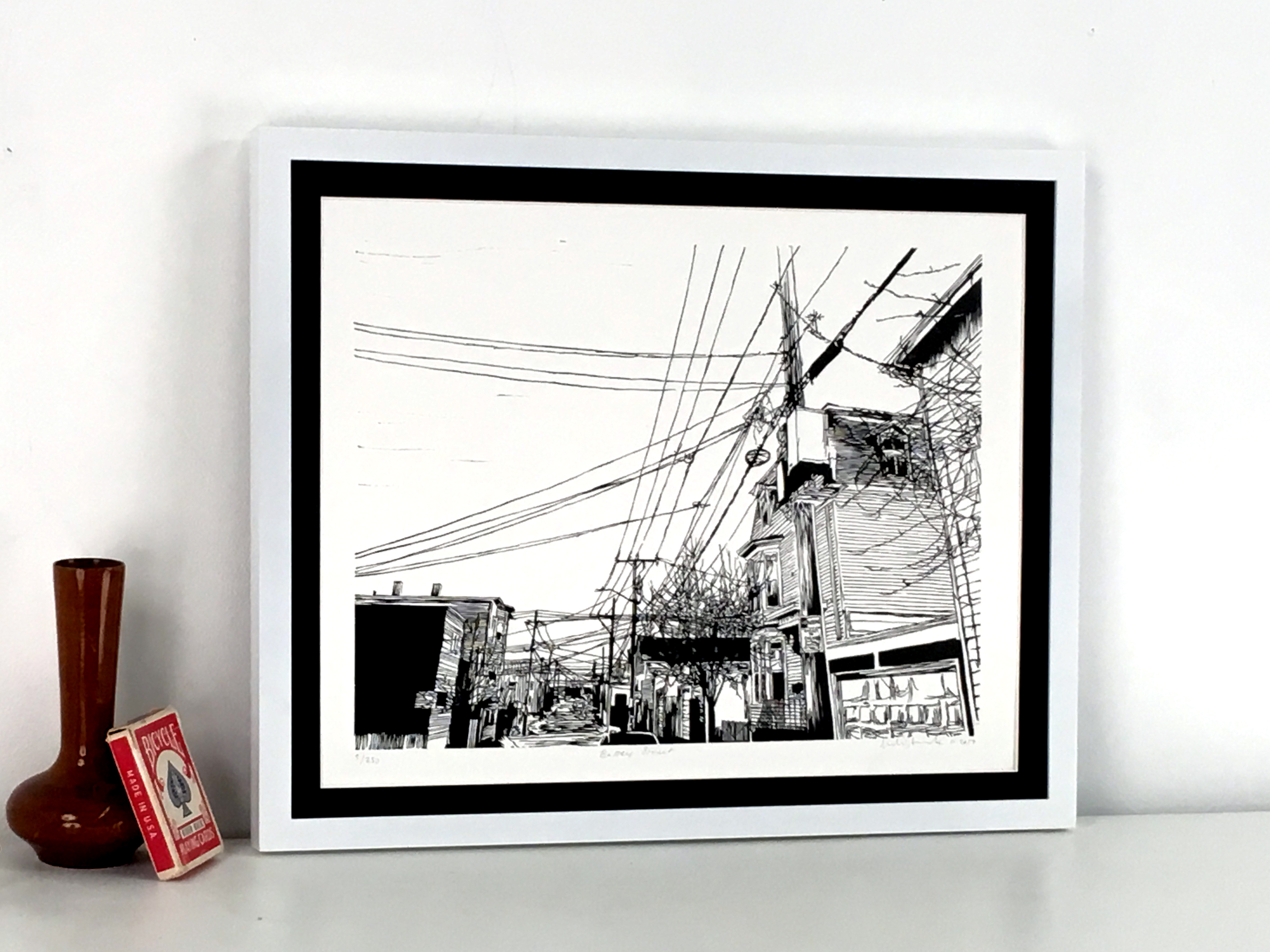
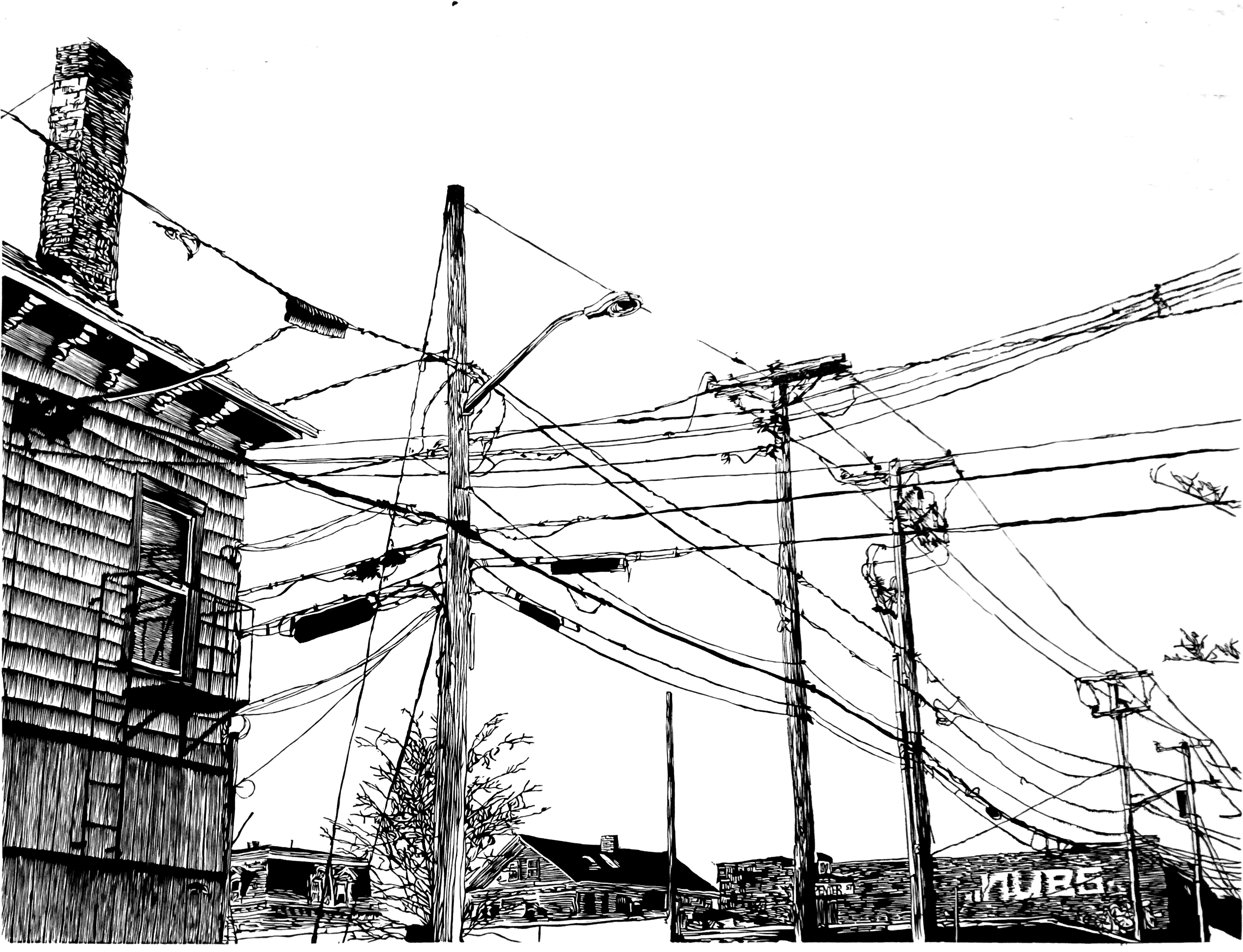
A pervasive theme of my portfolio is the conjunction and dissonance between human development and the natural
world’s commitment to persevere under the unyielding onslaught of industrialism. Intricacy and beauty is everywhere
in the world around us, and I am drawn to compositions that highlight the tragic beauty in aged decay,
overconsumption and forgotten wastelands we encounter every day. Power lines, phone cables, and chain-link and
barbed wire fences are installed, revised, outdated and forgotten, leaving behind dense webs of steel through which
the natural world is constantly attempting to reclaim its space. I love the challenge of translating these elements into
woodcut. Cables and wires silhouetted against a clear sky are elements positively drawn over deep negative space,
and in carving I invert this relationship, investing my effort into the areas carved away, the blank spaces. My
discipline and care is leaving behind and untouched the intention of the original artwork, that fence, cable, tree or vine
that exists in the real world.
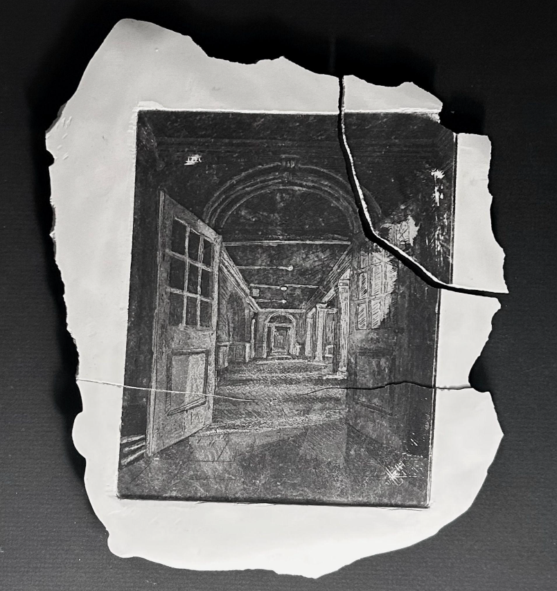
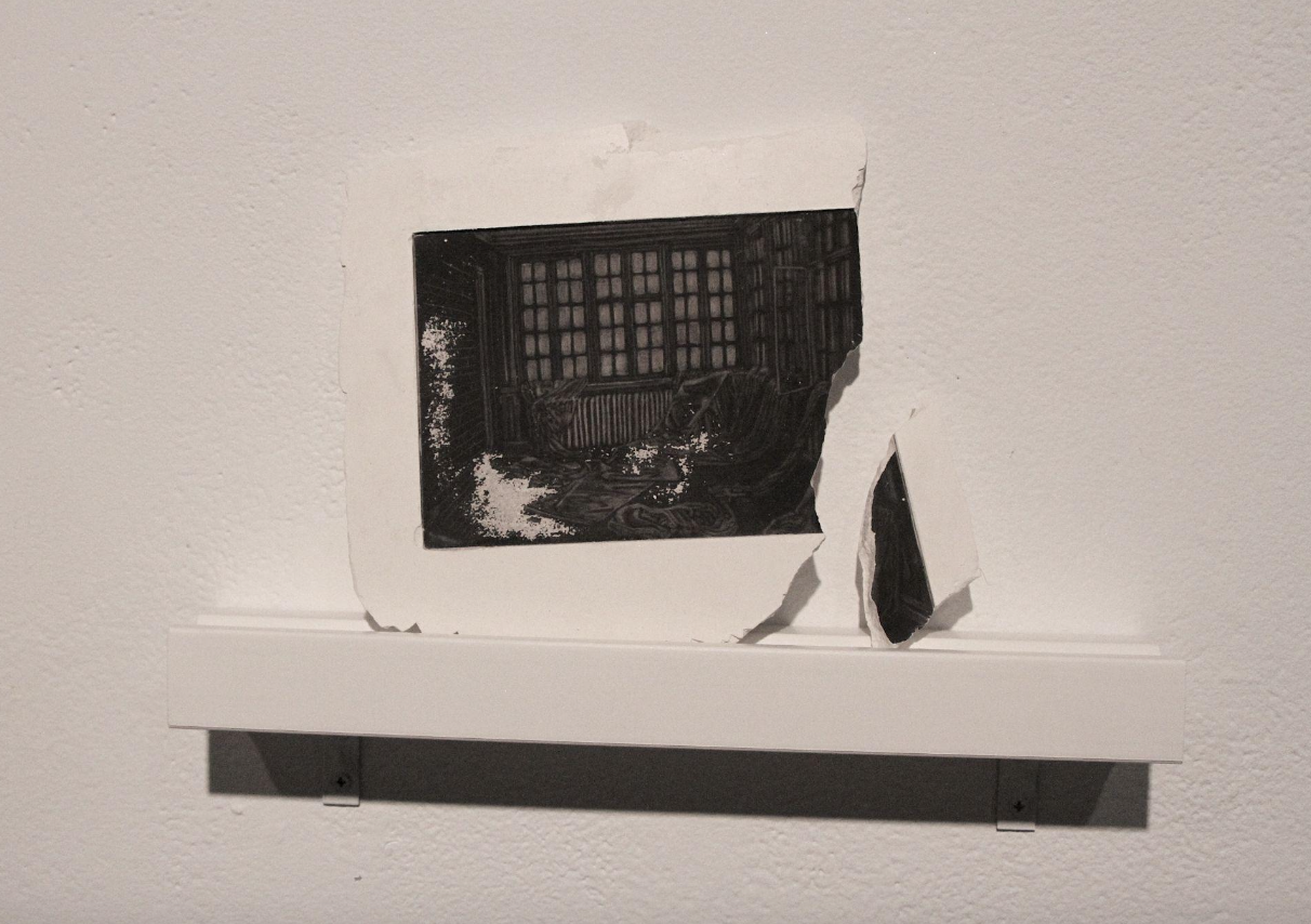
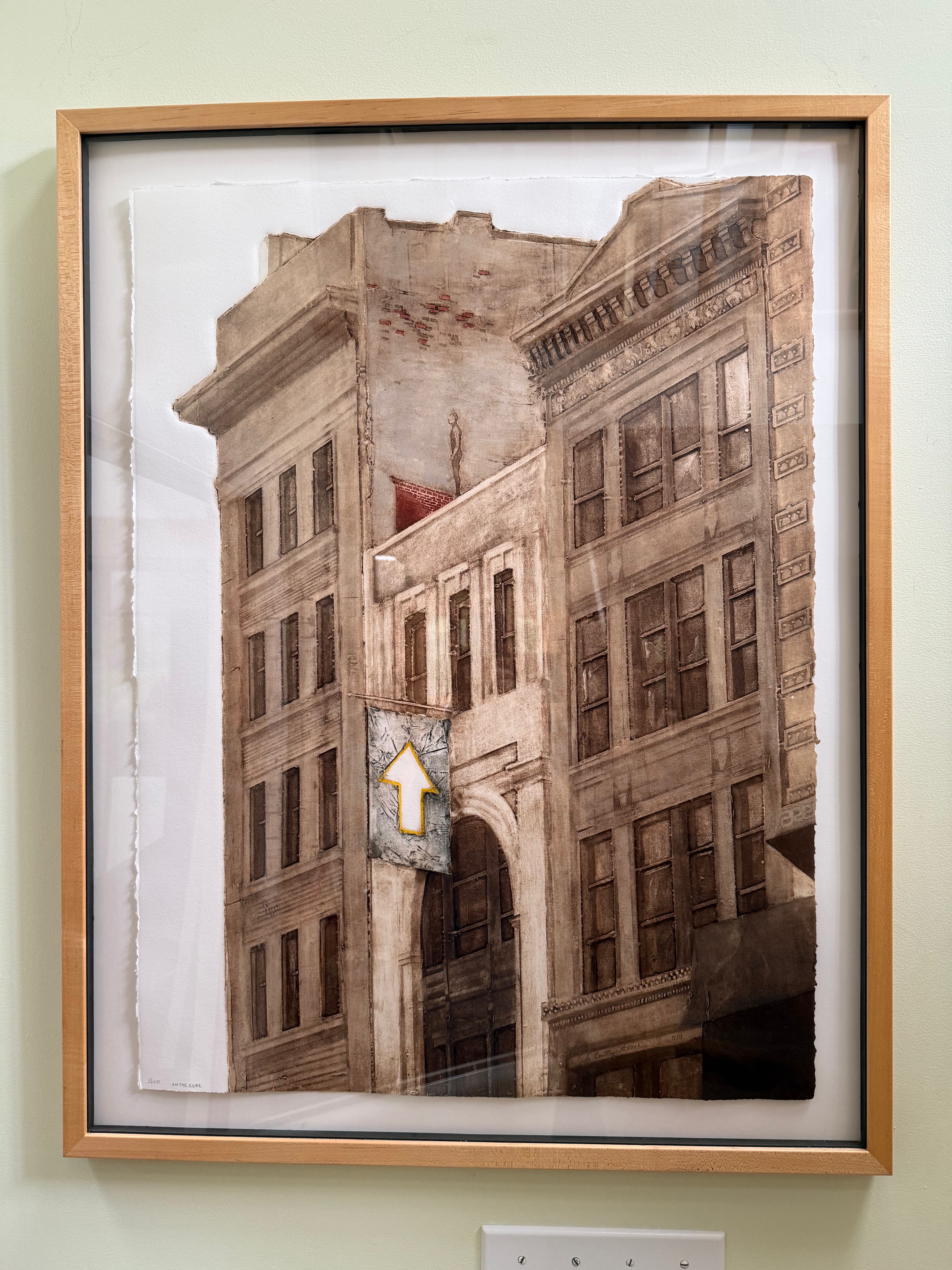
I am fascinated with history, mystery, memory and the natural world. My prints are a record of a specific time and place. My primary subject has always been light, natural or man-made.
As I observe an interesting scene, the effects of light, colors, shapes and shadows remain in my visual memory. These ideas can be as diverse as sunlight falling on a tree, a city streetlight casting a shadow, fluorescent light creeping through a doorway, or the long shadows cast by the afternoon sun in the desert.
I first became interested in etching over 40 years ago in art school. I began as a painting and drawing major but immediately became fascinated with printmaking. Etching combined my love of color with drawing, as etchings can be both linear and tonal. Recently, relief prints have become a part of my repertoire. My knowledge of color separation etching has influenced these multi-block linocuts. One of my objectives in my linocuts is to simplify my images; to become bolder.
Part of the joy of printmaking is the unexpected. No matter how much planning and experience is brought to an image, the print takes shape as it emerges, changing as it progresses. Even after more than 40 years, the challenge and excitement of watching a print progress remains both inspiring and motivating. My work has appeared in more than 275 national and international invitational and juried exhibitions, including The National Original Print Exhibition, London; Woolwich Contemporary Print Fair, London; The International Invitational Print Biennial of Douro, Portugal; New England on Paper: Contemporary Art in the Boston Athenaeum’s Print and Photographs Collection; the Rene Carcan International Prize for Printmaking, Brussels; and the Brooklyn Museum’s 22nd National Print Exhibition.
I have received awards from The Boston Printmakers, The Print Club of Albany and The Society of American Graphic Artists, including, in 2019 their annual award for outstanding achievement in printmaking. I was twice a finalist for the Rene Carcan International Prize for Printmaking in Brussels, and twice short-listed for the Mario Avati International Prize for Printmaking in Paris.
My etchings are in the permanent collections of the Brooklyn Museum, The Boston Athenaeum, The New York Public Library, The Museum of the City of New York, The National Museum of Women in the Arts, The Boston Public Library, and the University City Art Museum of the Guangzhou Academy of Fine Art, among others.
I enjoy breaking things down into smaller, more manageable pieces, appreciating the little things. This fits with my choice of printmaking as one of the art forms I use to express my ideas.
Psychology and the environment have always been my primary interests. I like to figure out how and why we think or act as we do as individuals and as a society. Placing these psychological interpretations into the natural environment also gives me a chance to express my concern for the choices we make regarding the health of the earth and for each other. These two topics often intertwine and traverse most of what I do in a day.
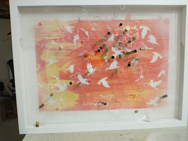
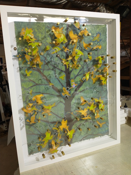
I am a screenprinter who has editioned enough prints to wallpaper a few houses… I’m taking a turn in my approach. The pieces in this exhibit are one-of-a-kind experiments based on the state of gun violence.
The first piece was created in 2014 after the Sandy Hook School shootings. “Witness Tree – Do it again”, was part of an exhibition called Vision/Revision. I printed an edition, then for the Revision, I took a print and shot at it with several guns that a friend had on his farm. He walked me through the process and helped me when the shotgun’s kick back was too much for my body. I was surprised that it took so many bullets to create so little damage to an inanimate object yet one bullet kills a living thing so quickly and completely. The school shooting was two years prior and took place 20 minutes from my town where first responders, who I still see, went there to help. It was on my mind for this work…
I didn’t make any more for over 10 years until presidential candidate Trump was shot during a campaign speech. Regardless of anyone’s political or person beliefs, I don’t think anyone should be shot. I started two series: “Peace Migration”, and “Witness Tree”. The work in this show is my attempt to put a new light on the difficult relationship we have with guns. Each piece uses the bird images I’ve been working with in my prints to simulate the power of the group to make change even through difficult obstacles – in this case the shootings. I am an optimist and I believe that peace is possible.
My hope is that at first glance the “pretty” nature of the work brings you in (Ah!), and then the bullets and bullet holes catch you off guard (Oh…) The surprise is part of the plan. There is beauty in the patterns, enough so that the violence often gets sidetracked until the viewer takes a closer look.
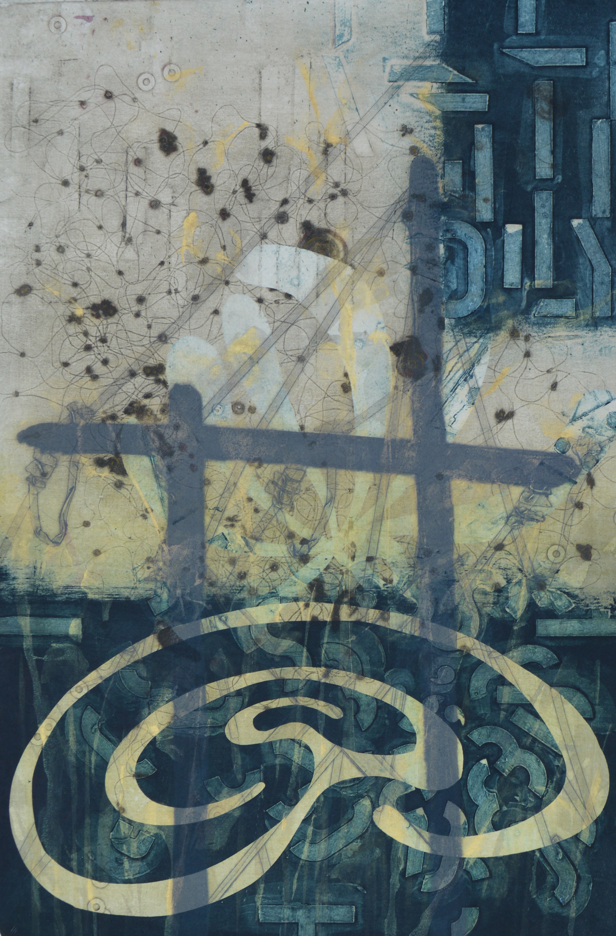
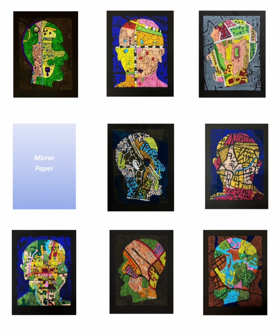
Salem: States of Mind is a suite of sixteen Map Portraits in a varied edition of two that were developed from maps of Salem: India, Isreal and fourteen of the United States as reference. Etymology, the origin and evolution of words meaning and idioms, in addition to maps fascinate me.
The name Salem has origins in Arabic and Hebrew meaning “peace’ or “place of well- being, and safety. It is also the root word of historical Jerusalem. Early Puritan settlers in North America adopted the name in hope of a harmonious society. Not all the residents, for example those from the infamous Witch Trials of Salem, Massachusetts have that experience.
Is where we live a result of: affordability; favorable climate; cultural opportunities; proximity to job; scenery; school system; lot size; privacy; prestige; distance from family; or just chance?
How do we “make up our minds”? The maps that influenced this suite of prints include the states of: Alabama, Connecticut, Illinois, Indiana, Massachusetts, Missouri, New Hampshire, New Jersey, New York, Ohio, Oregon, South Carolina, Utah and Virginia. I was piloting through one of these towns in February of 2025 when the project idea began to take shape. I have been making Map Portraits for a good number of years. I like that maps are an accepted abstraction that make the concepts vast amounts of space and time more tangible.
Map use, more recently in digital format, helps us plan our lives. We may be for example: consulting the upcoming weather forecast; following local or global news; using GPS to navigate efficient travel routes to new destinations or even home after a traffic jam caused by accidents.
Our minds are always in gear thinking, dreaming and doing, even our bodies are not. The technique used to create these prints is silkscreen monotype. It was my goal to try to free myself from some of the typical precision constraints of cartographic mark-making and printmaking. This is the is the fiftieth anniversary of my becoming a printmaker!
I added my penchant for texture by using movable matrices to create color areas in print from water-soluble pastel rubbings.. It was not an easy endeavor especially because the temperature and humidity in my studio varied by ten degrees while printing. This factor made it challenging and hard to control the paper and pigment release from the screen. But more importantly this portfolio project allowed me to express thoughts of making peace with life’s imperfections as an artist/advocate and care-giver of a son and sibling with neurodiversity, and dementia challenges.
This print process is one of the methods I learned from Lynwood Kreneck of Lubbock, Texas who sadly passed away on Aug 16, 2025. I met him several times and spent a week where he gave a workshop at Frogman Press. I told him one of my earlier Map Portraits “Mr. Freeway” which included a map of Lubbock, Texas where he taught at the University, made me think of him. The poses for these prints are front, three quarter and profile from the neck and shoulders up.It is a standardized template format used for passport photos or mugshots which are composed this way for quick and direct identification. I have been making Map Portraits for a number of years and also use other figure poses in my work. Here you will see some faces within faces and crosses that at times we are all brought to bear. It is for the viewer to decide if it is about the destination or the journey.
Like the disclaimer on map place mats found in restaurants my Map Portraits are for contemplation but not for navigation! Interactively, I hope, everyone is inspired to search, explore and maybe identify these coordinates!
Jo Yarrington is an interdisciplinary artist, working in printmaking, photography, installation, collecting, archival documentation and durational performance. Her work deals with themes related to the collective unconscious; using material explorations to reveal patterns and rituals hidden in the everyday. Within much of her work, time acts as medium and records become artifacts. It is in this space where the codes of representation are altered to take on new meanings often directing us to cosmos both large and small.
In her most recent work, her interest in pattern language has led to the development of immersive installations built around the use of found antique piano scrolls. Within these spaces, audiences use projections to activate the margins of the room while dancers and poets translate the notation into movement and spoken word. It is through these multi-mediated translations that the space in between object, sound, light and performer reveals itself as a transformative material.
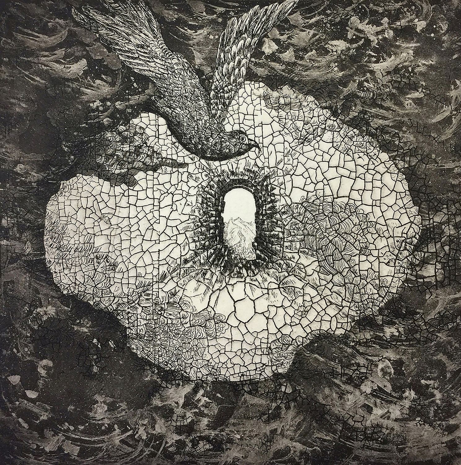
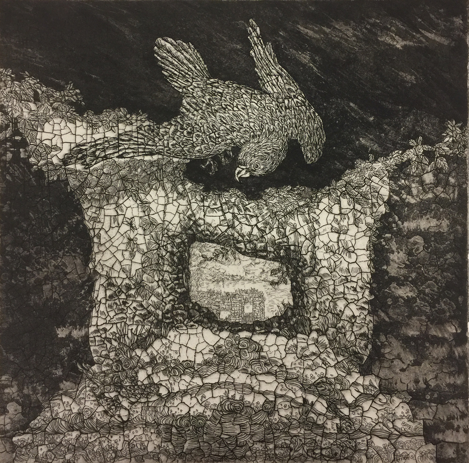
My recent etching works “Crossing I, II, III, and IIII” are inspired by my experience as an immigrant coming from Beijing, China to Connecticut. The power of living through these transitions is expressed in these works: Hawks, Phoenixes and Cranes fly out from gates and caves with broad brush strokes in the background. The balance and transition between eastern and western cultures and lifestyles are thus strongly indicated through my art.
“Crossing and Wondering I” Etching. Express the dream of power. I used the etching broken egg shell and white ground with aquatint methods to create a silhouette resembling a round clock and a human head as the main composition with texture wave background. Top center flying bird’s image, reflection of river and boat and frog start stand up to jump….. Like a dream.
Collagraphs are limited edition prints made from plates that are collages of paper, fabric, or other materials built up from a substrate. I make a drawing on tracing paper and use it to transfer shapes to thin, white paper. Paper shapes, adhered in layers, result in a low bas relief. Next, I adhere silk organza to the plate and paint areas of the plate with acrylic gloss medium to achieve a range of values. This technique is called silk aquatint because the weave of the organza holds and prints tiny specks of ink. The result looks much like traditional aquatint. Finally, I create textures using such materials as found objects or modeling paste. When the plate is complete, it is also sealed with acrylic, and I can intaglio ink it as I would a metal plate. Having more levels than a metal plate, I can add additional ink colors by rolling ink on the surface. Combining inks in this way provides many options for color effects achieved by choice of colors and the relative viscosities of the over and under colors. Printing a second plate over the first offers other possibilities. After many colors are applied, I cover the plate with dampened all-rag paper and special blankets that help force the paper into all the crevices and textures of the plate as it passes through the printing press. The press transfers ink to paper and also creates an embossment that remains after the ink is dried.


